Thursday 31 March 2011

EVALUATION QUESTION 8

Looking back at your preliminary task, what do you feel you have learned in the progression from it to the full product?

I have done some research on how my skills have progressed by looking at a previous prelim that I have done and comparing it to my final film.

I have mainly focused on the what would please the eye of the audience therefore I have compared two shots talking about each one's success.

MISE EN SCENE

The opening shot of my Prelim exercise was slightly out of focus as you can see, and the lighting was not very well thought through, now comparing it to the opening of my final film the lighting well thought of to make sure that it appeals to the audience. The genres of the two films are also extremely different.
I have learnt to focus on mise en scene a lot more and noticed the drastic difference that it makes in the quality of video. Some of the props that we have used; costumes, I have now noticed how much of a difference it makes to the value of the film. In my prelim I have used very little amount of notice in the clothes that we wore and the locations of which we filmed at. Here have a judge for yourself:

Now in these two shots you will notice that the camera angles are used for completely different styles of effects. The first screenshot was completely unplanned and took a lot of effort to make look professional, however with the final film, the outfit was discussed and bought earlier which made it so much easier to create effect-full shots to reach the kind of feedback that you would like from your audience.

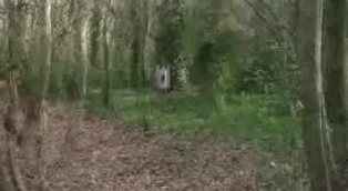
The location that we had used for our filming in the prelim was completely not thought about. It was something that took us a while to adapt to, to make look more professional. Where as the location for the prelim was discussed in advance and we as a group went down to see it and elaborate on whether or not we thought it was the right location for our final film.

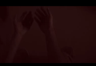
.In these two screenshots, I have displayed the difference between the two types of locations. The prelim seems more dull and is not as effective for the audience, whereas the second screenshot of the final film looks more attractive, eventful. the lighting again plays a big part in both of these shots. The lighting in the prelim I believe is what makes the shot look so dull whereas the screenshot from my final film is light and some of the lighting effects are used to create more tension for instance the bruising that you can see on the legs of the girl are not created by make up, it is just good use of lighting. Having that said we did pay attention to make-up of the main character to make sure that she looks scary enough, we simply did this by wetting the hair and making it messy and all over the characters face. 

CAMERA


As you can see, we experimented with the camera to see how many various shots we can get so that when it comes to editing were not lacking. Taking a lot of footage is something that I learnt in a lecture at london university, when the chief examiner gave us advice on how we can make sure to be on our way to good films. In my prelim however, the shots that were used were not as experimental or effective, they were all pretty much the same to an extent, which to a live audience I suppose would be really not interesting. Most of the shots taken are zoom-ins. Just to have a slight more bit of variation.

EDITING
This shot is I think a perfect example of how much attention we payed to making sure that we did enough. This shot shows different effects and overlapping of images which is way more than I had when filming the prelim:
As you can see this is extremely dull in comparison to the picture above. There are no effects, the lighting is too dark. and the shot is slightly unbalanced. In the first screenshot we used a strategy that as a group we named the 'dadada effect' this is when you get a flash of re-occuring images. We found that this is very effective and according to our audience feedback we have decided that this was one of the most effective things that we had included in our final film. 

SOUND

In my prelim the sound that we use was hardly cared for, we just chose sound from the effects that had already been created in soundtrack pro, however we put so much care into the soundtrack making of the final film. 
Here is another sample of our inspirations: 


LESSON LEARNT

I have learnt how to organise my time, the key skill to media: BE CREATIVE!!
My awareness of technology has expanded dramatically, I hadn't even heard of the technology that I have been using before I started my coursework. This is all thanks to Mary, Rebecca and the tech guys who have helped us so much along the way, THANK YOU!!

EVALUATION QUESTION 7

What have you learned about technologies from the process of constructing this product?
Here is our way of showing you what we have learnt of technologies...


EVALUATION QUESTION 6

Audience feedback and comments...

Here is some class feedback:


I have made videos of random audience feedback, here is a few samples from what the audience had to say:


Having looked at this feedback I now see the main high points of the video, things that were most effective and things that could be improved; having the text on the screen. I have realised that the videos that have been made for this have had excellent feedback from out main target audience (even the boys!). This is beneficial for us because it outlines the fact that we have reached our target audience and have accomplished our ambition meaning that the movie is a success.

EVALUATION QUESTION 4&5

What kind of media institution might distribute your media product and why? How will you attract/address your audience?

Considering that our movie is of a low budget, the expectations are nothing at all like having an audience in odeon or a major budget for advertising and promoting our product. We have uploaded our video to vimeo. This is a website that is pretty much of the same structure as youtube however, it is more private, containing passwords and folders that have sorted out groups of work. Here is an example:
This is so that our video can get out to a wider audience and be reviewed. This is beneficial for us because it allows us to get feedback from different types of audiences.
Another way of us getting people to see the work that we have done is by posting it on a social networking site, here is an example:
This is just some feedback that we have received from an audience.


We could also get people to notice our film by publishing it in magazines. Considering that our film is directed at a female audience we could publish it in a magazine like Ok or GRAZIA. but to get a good general overview from all audiences we could publish an article about it in a magazine such as Total Film.


Taking into account that our movie is not of a major budget or production our launching of the movie did not occur in a big brand cinema. Therefore we resulted to a more private screening which still fulfilled it's purpose in the end.

We are also going to experience a DVD release which puts us in a position to have even a wider audience and the publishing experience.

EVALUATION QUESTION 3

Who would be the audience for your media product?
This is Lydia, 17, she goes to a private girls school in north london. She is a fan of thrillers and horror movies, her favourite movies is 'Clockwork Orange' by 'Stanley Kubrick'. Favourite hobbies: painting, reading, H&M, and she loves history and 16th century art!!
Considering that our movie is a psychological supernatural thriller, she is the perfect audience. We did a survey in class and had decided that our target audience is females between the ages of 16 - 40. Below is a diagram that shows more information about the popularity of thriller genres:

Here is some feedback from what she had to say about my thriller:

This is pretty much what we expected for our audience, therefore I feel like our movie has reached our original target audience. 


Evaluation - Question 4&5

What kind of media institution might distribute your media product and why? How will you attract/address your audience?

As our opening is made from a small independent company, a small distributor would be used to distribute the film. We have a low budget, so we cannot use advertising, however, using the internet, we can still get our product out directly to the public.

To get the film out to the public, there are different websites we could put it on, seeing as we don't have a budget for a chain of cinemas. By putting it on social networks such as facebook or twitter, the film can get out to hundreds of people if it if viewed, then shared. The video would be getting out to our target of older teenagers plus, as they are the people who typically use social networks.

Also, the opening is up on 'Vimeo,' a website that holds profesional movie clips which are usually viewed by people that have to be logged on. This limits the amount of people that can view the film. Youtube however has a large audience as any member of the public can view a video without being logged on.


Next tuesday, we will be watching all of the openings in the cinema 'Screen on the green' which is an independent cinema, as chain cinema's such as 'Vue' and 'Cineworld' would only play bigger budget films. As all of the students are going to be watching the opening, we will be getting straight to the bottom end of the catchment of older teens.
There will also be a dvd release so we can take the films home with us. The video is also on the blog, which will be viewed by other students.

Using these methods, we are getting straight to our target audience and bringing the film to them.

EVALUATION

3) Who would be the audience for your media product?
Create a montage of images depicting the contents of the handbag belonging to the typical target audience member of your movie. Write up a little lifestyle summary like this: "Kenny, 27, an aspirer working in an advertising agency, loves going to the cinema, shops in H&M..." etc.
You may realise that your original target audience is not actually suitable for the film you have produced- so you may show how this has been adapted.


Name: Zoe Runner

D.O.B: 13.11.1989

Zoe .R is a outgoing young lady who loves cats and flowers! She very much enjoys to watch comedy, romance, action, thriller and supernatural genres- telling us that she spends most of the time that she should be studying, watching films on her laptop!
 In her spare time, she goes shopping in Selfridges with her best friends; Kate and Daisy.
At the moment, she is reading a Supernatural thriller book; Guardians of the soul Lambent. (Book 1) 
 She works as an assistant to the Director of the television series, 'Doctor who'. She loves her job because she's always surrounded by a new world with a lot of action and thrill in every day of the job, whilst helping her boss with small errands such as fetching him his morning coffee.
She loves going to the cinema and enjoy the experience and has told us that she has calculated that she spends at least £30 a month on just going to the cinema! (Including refreshments and popcorn)

Favorite film?
"I got to say... True romance is in my top ten. Its a romantic, action thriller with a bit of a psychological twist to it. ItsBased around this newly wedded couple getting themselves in a LOT of trouble with drug dealers, gangsters and drug addicted film producers. Its hard to believe but its just so romantic and action packed!"


As we were writing the title opening, we didn't really put too much thought about what sort of audience we would aim for- gender wise. But then in the out come of our film, we realised that the film would most likely get more of a female audience due to the supernatural side to it as well as the female leading role of 'Violet' who haunts a man who killed her, which shows strength to the women in the film- which would possible advertise to the feminists to want to watch a female dominated film.
When we had our title sequence watched by the rest of our class- even though we got positive feedback from both the male and female viewers, they all agreed, when it came to voting, that the female viewers would most likely want to pay to watch the film in the cinema.

EVALUATION QUESTION 2

How does your media product represent particular social groups?

SIMILARITIES BETWEEN SCENERY!

Sometimes it is useful for audience to recognise characters from other movies within the title sequence. Here are a few shots that I have found and compared that use intertextuality from other films.
These two shots are extremely similar because of the setting and the girls natural 'habitat'. Both characters (tamara from 'the ring' and Violet from my thriller) have found themselves comfortable in a forest. It is a great setting and entertaining for the audience. 'The ring' was a successful thriller therefore if the audience sees that the mise en scene is similar audience of the movie will be more impressed with the movie.

SIMILARITIES BETWEEN CHARACTERS!
VIOLET...

Again I am going to compare 'tamara' from the ring to myself as the main character of the thriller because the aspects of the story lines in both cases are very similar. The greenery is also a re-occuring view. Another character that 'violet' can relate to is the grudge. All three girls (tamara, the grudge and violet) are victims which is reflected in the clothing. All three are wearing a white dress indicating a sense of goodness. This was intertextuality on my part when planning out the mise en scene - the costumes. I have also attached a screenshot from my own movie to make clear the similarities between all three characters. Although the image shot is taken from a distance in my opening it still is expected to have the same look and effect.

We also tried to make this scene more thrilling by creating a sequence making it seem like the girl was getting closer with each shot.

The audience first acknowledges that there is somebody in the distance in this shot:
Them this theme continues when she appears a lot closer in the next shot.


And finally the girl is back in centre screen, while the camera is still in the same distance. But this is the closest to the screen that she gets therefore nobody still sees her real identity. The hair and costume is the main thing that is similar to the girls in the movies listed above.


THE PASSIONATE MURDERER...

This character reminds me particularly of a movie that I have earlier blogged about from the movie 'the lovely bones'. I believe that in this movie his role was very effective just like in our opening. He was a man who was passionate and obsessed just like our character in our thriller, also with a dark secret as the victims begin to seek for their revenge. I have chosen to display him through this picture in particular because this is an image of him with a shadow on his face of the trees. When working on the mise en scene for our movie, I had photos taken of me from the stalkers point of view, the picture that I have used of a character called 'George Harvey' (the lovely bones) he is behind branches, well this is the perspective that we imagined that our villain would be when stalking Violet. This is reflected in the pictures where there is a clear view of branches in the photograph because the villain could not get close enough without her seeing him.

EVALUATION

2) How does your media product represent particular social groups?
Choose one or two stills of characters from your own movie opening and compare how they are represented (similarities/differences) to one or two stills from characters in a real movie opening which has inspired you.


This is the main character in our title sequence, the characters name is Violet. |(Actress, Erika. A) When we decided on what sort of story out title sequence was going to be, it was inevitable that the girl should wear a white dress. This is because white can signify innocence. And the blood stained on the dress makes her look victimised, which yet again connects to the innocence of the character. But the hair that covers some of her face as well as the effect that creates dark rings under her eyes, gives the impression that shes not as innocent as she's made out to look. In one of my past blogs, I mentioned the ring and how their title sequence has inspired me. That wasn't the only thing that had inspired us from the ring as I have noticed that the ring has a very similar mise en scene to the wardrobe to Violet.


As you can see from the image above, the girl from the ring has the same dark eyes and long hair that partially covers her face etc. 
Even though these two characters seem to look very much alike, they have defined differences. 
From the way that they equally move in their separate films, presents on how one is the victim and the other is the villain. In Violet, Violet is the victim that seems to get her revenge by haunting her murderer, even though haunting a man to near insanity would be seen as being a villain, in this situation, we wanted the audience to side with Violet. Where as in the 'Ring', the girl is the evil ghost that kills innocent people. The audience does not side with the girl as they want the victims of the people who get haunted by the girl to live and survive the encounter. 

EVALUATION QUESTION 1

In what ways does your media product use, develop or challenge forms and conventions of real media products?

I am going to compare nine shots from a title sequence of our inspired 'Se7en'.
On 'www.artofthetitlesequence.com'. This will include nine shots from my own title sequence in comparison with the se7en title sequence. I want to outline how my opening sequence uses, develops and even challenges the forms and conventions of real media products.


This is an example of you will find on 'the art of the title sequence'. Now, I am going to find nine shots from my own title sequence that resemble our original inspiration in any way and analyse the similarities and differences.

Here is a few screen shots that show a variation between my use of different types of shots from my own title sequence and a few titles themselves. There difference that you will already be able to acknowledge is that unlike se7en, our title sequence does not contain the titles on the actually images themselves. This was our own personal trademark that re-occurs through out our title sequence that does not take place in at all in the title sequence of 'se7en'. 


As you can probably see, both of these shots contain the titles of the productions. The differences between the two are extremely noticeable on the screen, for starters the screenshot taken from 'se7en' is on a background of something that is already the beginning of images that we are going to see something else on the screen however, my title sequence is completely unpredictable, over visual effects we had sound effects that right away indicated that this was going to be a thriller, but there is only so much that you can show on a picture. Considering that the 'old mill productions presents' only shows the style of the 'creepy' chosen text and the music, is it arguable that without any real information given so far it engages the audience even more than something that contains primary information?


This shot is one of my favourites, unfortunately, it is quiet dark, the differences between these two shots is that they are both taken from different angles, the idea behind them is pretty much the same, however in the screenshot from 'se7en' i believe that what was being portrayed was somebody who is in control of the situation, he has his hands on the notes, on his private property, this emphasises on the fact that the character has got something to hide, but he is in control of what he is hiding. On the other hand the shot that I have taken from my title sequence is portrayed in a different way. My characters hand are open for the audience to see, the audience knows what he has done, he's not in control of what the audience can see. I also thought that even though the lighting in really dark in this shot is still reflects to a certain extent on the atmosphere of the situation, the darkness has a slight bit of red in that was done through the editing, signifying blood. Our opening isn't the same as 'se7en' because we didn't want it to be, we have borrowed aspects on something that we would agree is original and this will be reflected in further shots that i am going to discuss. 


I know that when you look at these two shots, there are no obvious similarities what's so ever. The angles are all completely different. The screenshot taken from 'se7en' is an extreme close-up of fingers and the screen shot taken from my opening is a wide shot of a full body. If you step back and try and have a look at what the two characters are doing you will see more similarities. For instance in the 'se7en' screenshot we see pealing of the fingerprints, a change, an unknown identity. In the screenshot taken from my thriller we see a person, but we do not see a face, in my opinion the two shots are both thrilling and inviting towards the audience. We don't see any real characters, just aspects of them. 


This is probably one of the most important shots in both title openings. In se7en the title is written small and is on a filmed background. My opening is on a black background, both texts are effective, and something that I cannot show you with a photograph but the 'Violet' turns to the colour violet in a few seconds. The fact that the title is so big, it takes the focus off all the other titles, which admittedly I would change if I had to do this all over again. 


This is a shot that I have personally found very effective within both thrillers. In 'se7en' you can tell a lot about the character, the close up of the pen and the paper as he slowly writes notes is extremely well done. It shows us that the character is very precise and pays attention to detail. In my opening shot the camera is watching the hand movements and photographs from a distance. It is not an extreme close-up as the other one is, but the shirt sleeves and veiny hands give away information about the character showing that they are of an older age. The photographs scattered over the table show that he is not precise and doesn't pay as much attention to things as the other villain would.


I have chosen this shot to display the use of names within the two openings. Of course the two had to follow their original patterns that is why yet again se7en has footage behind the titles and my opening doesn't, but I believe it is more suspenseful, to maybe have a break in between harsh flashing shots, which makes the audience eager to see more. 


These are two shots that are similar because of the lighter atmosphere in the background. They both add some freshness to the darkness and gloominess of the rest of the film. They are both effective extreme close-ups which give more information about the rest of the movie. Our 'violet' title is reflected in this 'forest violet flower'. Where as the se7en screenshot is again the re-occuring theme of close-up fingers, where the villain is playing with metal indicating this movie is going to be almost an ongoing unpredictable game. 


The significance of these two shots is again the titles. Whilst I believe the titles in se7en are hidden in this screenshot under the 'play bar' I suppose my opening is yet again more suspenseful just because it is a break from the flashing images, however I do still think that the blending titles with footage is also extremely effective. 


The two things in this that are alike is the greenery of the screenshots. Whilst the close up of the dollar bill is to indicate what the movie is about, it contains money and some sort of criminal aspect. Where as my opening is a wide shot of the main character and at that a wide/establishing shot again showing people more of the details of the movie reflecting that it is not so much a criminal thriller as it is a psychological sci-fi thriller.