The title sequence is a crucial part of film, giving away a clue of what the movie is about.
For instance:

ROCKY - Franklin Gothic Heavy
The style of the title "ROCKY" reflects upon elements within the movie. The text is 'big', 'bold', 'broad', 'simple' imitating upon the main character "Rocky the boxer". The style of the movie is sans-serif 'punching' out the title. This is more commonly used in comedies, action movies, and anything else that is ordinary - day to day life for most people. It is a more friendly informal text. This can supposedly echo the type of social class that the movie will be based on.
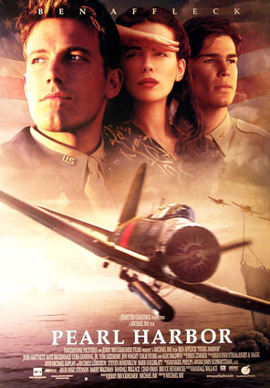
PEARL HARBOR - Palatino
Pearl Harbor is the complete opposite style of lettering to Rocky. It is of a Serif font, it is 'bold' to an extent but has been displayed in a more subtle way. Serif fonts are an 'old fashioned' way of writing, giving the audience more of an insite to the time period that the movie was set in. The letters are more 'formal' conveying their importance. The letters also reflect upon the characters, in this case the pilots. They stand tall which makes them look all the more relevant and important.
No comments:
Post a Comment